Case Study
The idea for an REI subscription originated with the REI Corporate Marketing team, who was hoping to use this offering as a vehicle to attract a new and diverse customer base. The project had initially been scoped as a vision by a Marketing VP, and early marketing research had been conducted by third party agencies eighteen months prior to my arrival. However, there had been no significant internal Product or UX involvement in the project, and I was brought in to quickly get up to speed and bring voice of the customer to a rapidly approaching in-market test.
Highlights Include
- User Interface Design
- Wireframes
- Responsive Design
- User Interviews
- User Testing
- Content Testing
- Stakeholder Workshops
- Test and Learn Discovery
- Product Evangelism
The Process
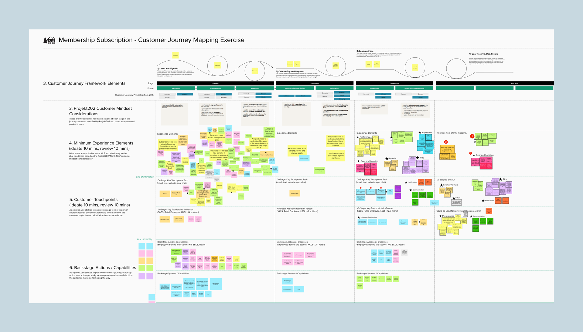
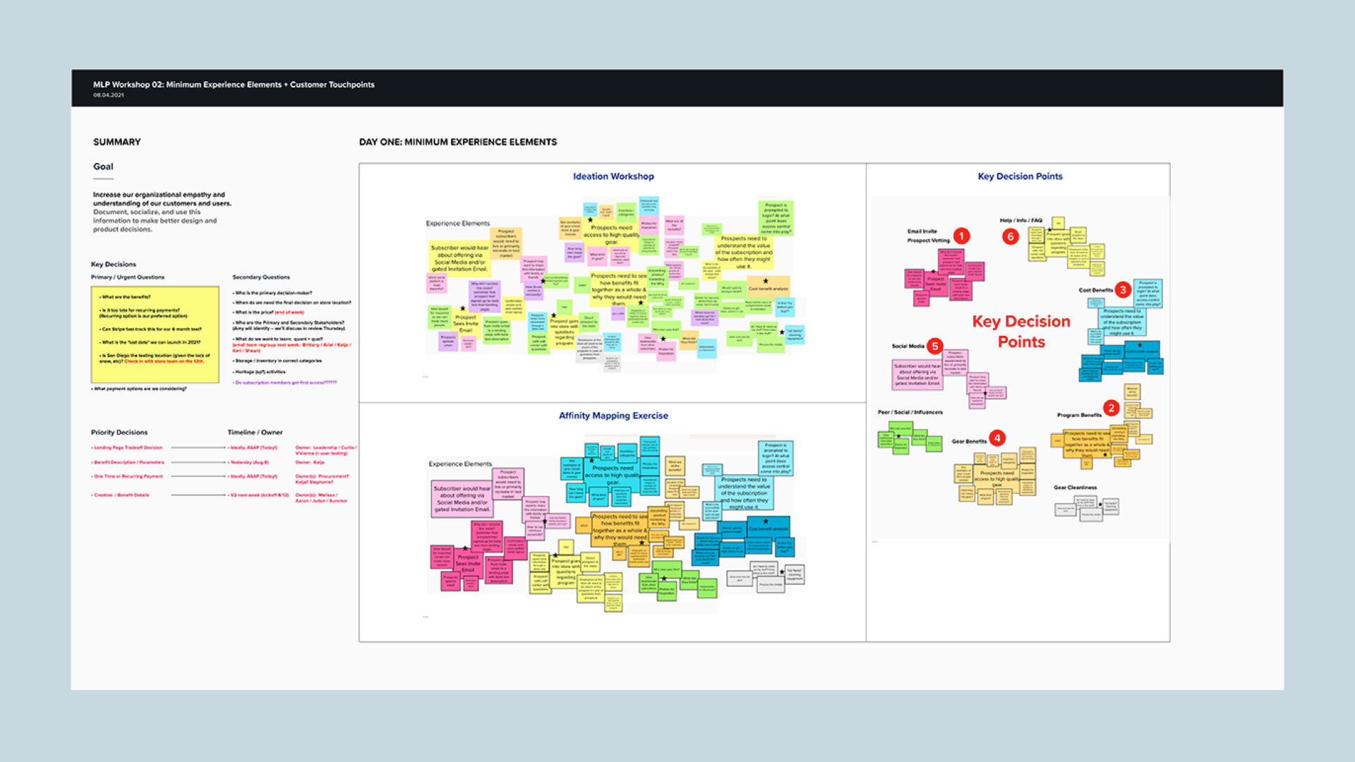
Although the Marketing team had worked with external vendors on aspirational ideation, little had been done to bring the voice of the customer into the offering or clarify the problem statement. Coming into this role required me to get up to speed quickly on the decisions made prior to my arrival, and I initiated a series of stakeholder workshops (starting my second week of the engagement) to understand the goals and motivations of stakeholders in the project.
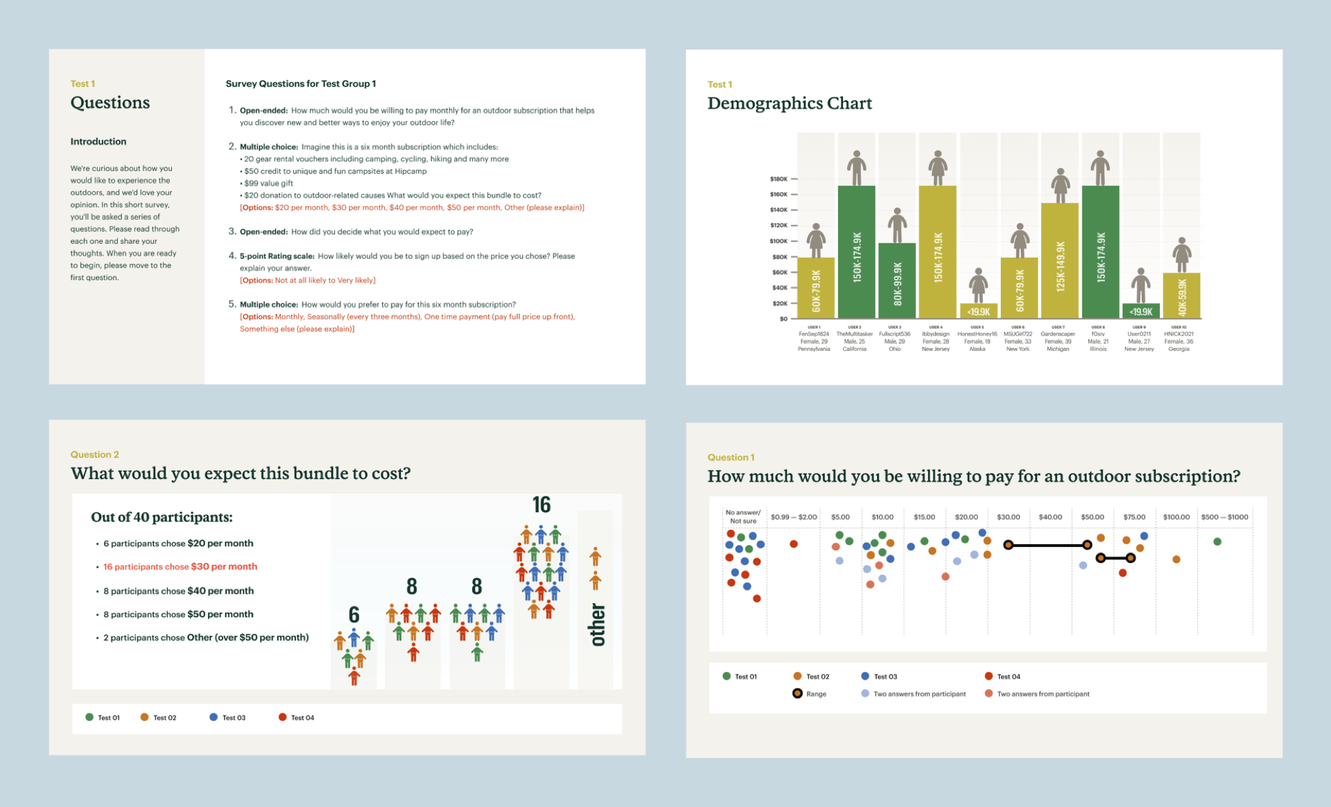
User Testing
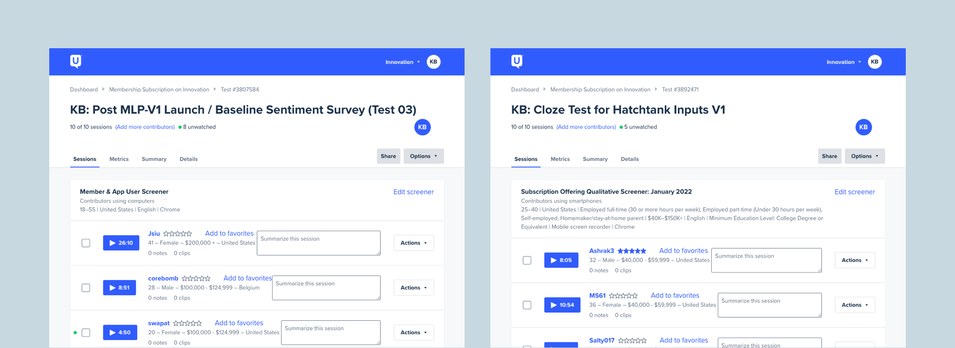
After the initial workshops I pivoted my efforts to running extensive qualitative tests on UserTesting.com. The methodologies included content comprehension testing, live interviews and prototype testing. Each series of tests were recorded and documented for reference across Stakeholder teams and also presented to display the questions and demographics.
In addition to running workshops and brainstorming sessions in Mural, I iteratively tested design versions with users to experiment and refine the visual language within the product space and design beautiful, usable interfaces.
Consistently, through months of hands-on qualitative testing and interviews, I received strong signal and feedback from the participants that there was not a strong appetite for the subscription, citing confusion around the package, pricing, value and benefits.
Artefacts included detailed documentation and research read-outs in Confluence, Notion and Figma to have both a quick reference for everything from interviews to vendor studies and user tests.
Design Phase
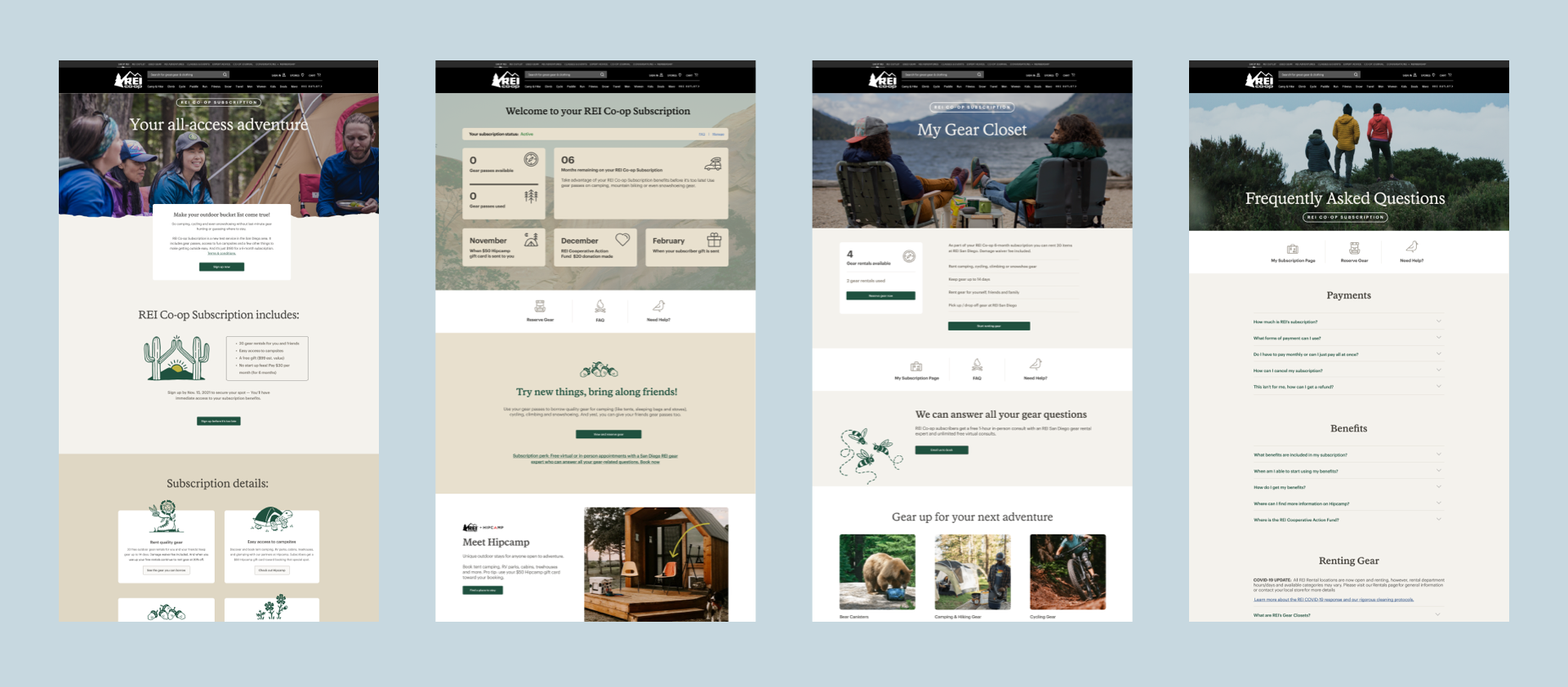
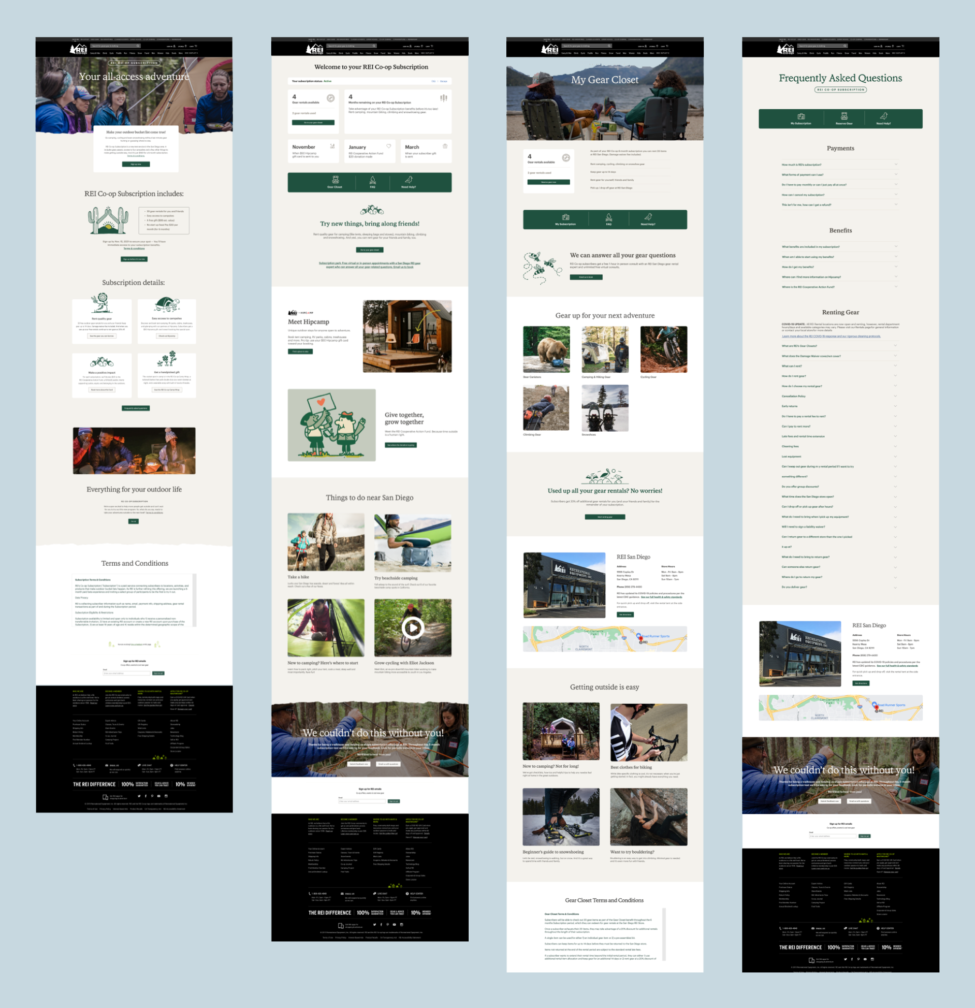
Drawing on my design background —including accessibility, typography, color and spacial design — I championed best practices across design and content. I partnered closely with both Accessibility and Design System teams and collaborated with the Brand Team to ensure that my designs were engaging and on-brand.
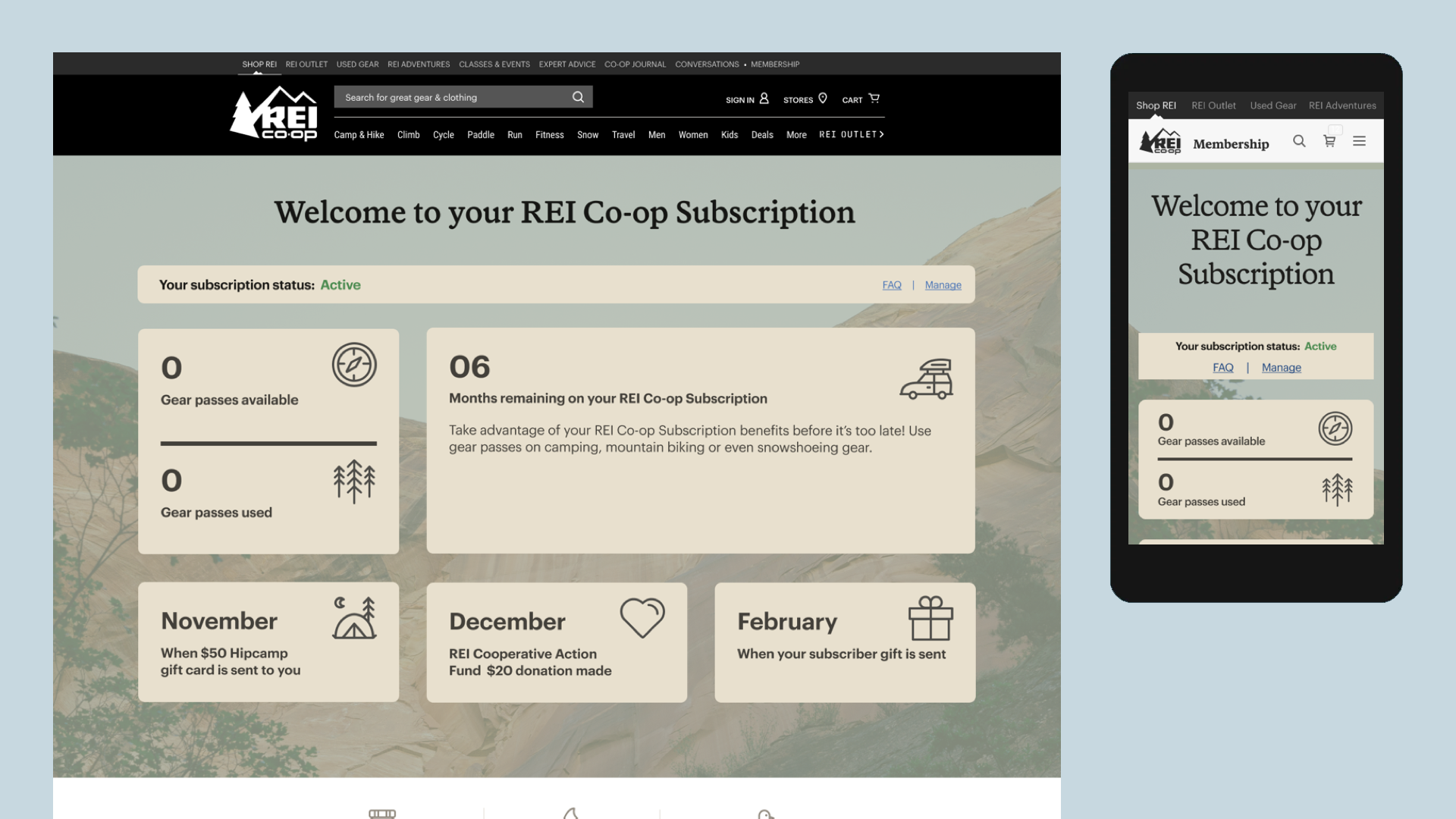
Ultimately, the Marketing team decided to move forward with an in-market test. I designed all collateral supporting the test, including social media posts, emails, and pixel-perfect websites both advertising the offering and supporting the potential test customers once they signed up.
Results
The first run of Membership Subscription test design was released November 2021. Initial response was low but not unexpected; UX Research conducted throughout indicated that users consistently expressed that the price and benefit package (unchanged by Marketing) held no personal appeal. Feedback regarding the content and design was consistently positive, but not enough to overcome the price and pilot benefit package.
Although the low sign-up response was disappointing to Marketing Stakeholders, it strongly proved out the ongoing UX hypothesis of a missed alignment between internal stakeholder assumptions and what the customers actually want.
As a result, the initial Subscription Test findings offered the Innovation Team a unique opportunity to educate our stakeholders on the value of test and learn for the larger organization to prove out the feasibility of new products.
Methodologies
- UX Strategy
- Brainstorming Workshops
- Stakeholder Interviews
- UX / UI Design
- Branding and Visual Design
- Accessibility
Tools
- Design System
- Figma
- Mural
- UserTesting.com